What is brand ethos, and where does it live?
Walk into an Apple store with your eyes half-closed and you will still know which store you are in.
Walk into an Apple store with your eyes half-closed and you will still know which store you are in. The light bounces off the glass a particular way. The wood and the steel are arranged a particular way. The air around the product is doing something nobody at the Microsoft store has figured out. I [Jae] noticed this once and have never quite been able to let it go. The logo on the wall is not why you knew. The logo is the smallest part of why you knew.
This piece is not really about Adtivity, although we will get to Adtivity. It is about the question every brand is answering whether they realise it or not. What is your ethos, and how does it speak before you have said anything? Because the brands you remember speak before they speak. The ones you forget never do.
The principle, in two quotes
Paul Rand designed the IBM logo, the ABC logo, the NeXT logo and most of the visual identity of modern American business. He spent his career saying things that should be obvious and somehow aren't. Two of them are the entire spine of this piece.
The first is that design is the silent ambassador of your brand. Your visual identity is talking to a person before you are. The greeting they hear is the typography, the colour, the spacing, the texture, the photography style, the way an icon turns. It is the whole opening line of your relationship with them, and you do not get to write it twice.
The second is that a logo doesn't sell, it identifies. The logo is a stamp on the conversation, not the conversation itself. The conversation is everything that happens in the other elements. The logo just tells you whose conversation it is.
Walter Landor, who founded the modern branding agency on a ferry boat in San Francisco in 1941, said the third line of the same idea. Products are made in the factory, but brands are created in the mind. The factory is busy. The mind is doing the actual work.
Apple
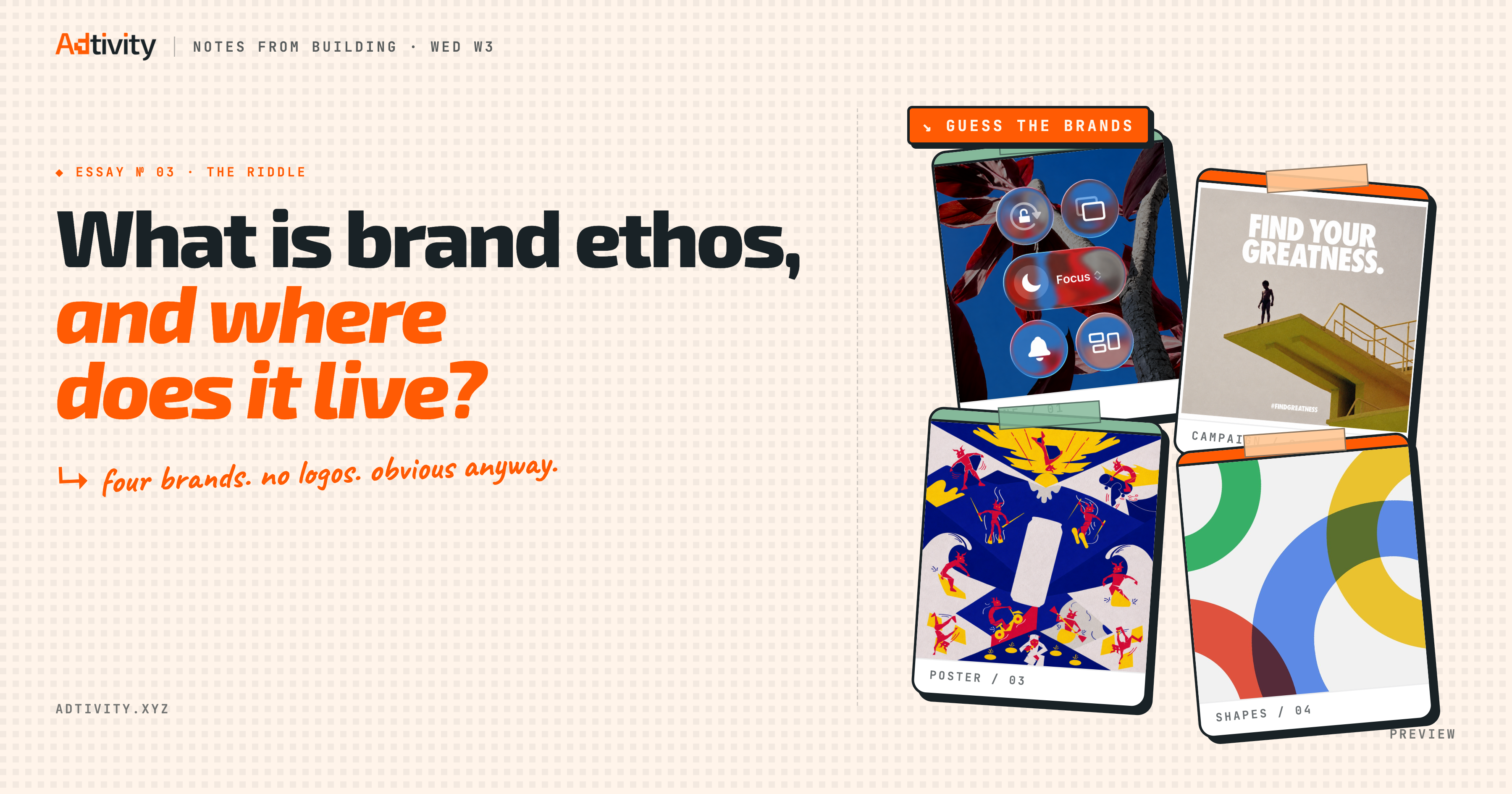
Apple's ethos has been simplicity since they decided it was. Steve Jobs called it the ultimate sophistication, drawing from da Vinci, and it has been their north star for most of the company's life. The proof is everything they ship. In 2025 they renamed their entire design language Liquid Glass and rebuilt iOS, iPadOS, macOS and watchOS around a single material that bends and shapes light, because they decided the language of their next decade was translucency. One word, ten years of consequences.
You see a Liquid Glass interface and you know it is Apple. You see a white room with one product on a pedestal and you know it is Apple. You see Helvetica cut a particular way and you know it is Apple. The logo is the period at the end of the sentence, not the sentence itself.
Nike
Nike's ethos is Just Do It, and almost everything else about Nike is wallpaper to that line. Phil Knight built the company. Dan Wieden of Wieden+Kennedy wrote the line in 1988, three words drawn partly from the last words of a death-row inmate because Wieden wanted something with stakes. Knight reportedly hated the line at first. He kept it anyway.
Now every Nike ad is the same ad. A person who looks tired. A moment they could quit. A choice. The Swoosh appears for half a second at the end, almost as a courtesy. The shoes are different every season. The line never changes. The ethos shows up in every athlete they sign, every commercial they cut, every store they design. Just do it shows up before the products do.
Red Bull
Red Bull sells caffeine and sugar in a slim metal can, but Red Bull's ethos is lift. Gives You Wings is a slogan that would mean nothing if Red Bull only ran print ads. What makes the slogan land is everything Red Bull spends its money on. They sent Felix Baumgartner to the edge of space in 2012 and let him fall back to earth. They own a Formula 1 team that has won the championship. They run a cliff diving series and fund a spinal-cord research foundation they named Wings for Life. The athletes they sponsor are all the same athlete: a person doing something close to flying.
You can identify Red Bull's ethos without ever drinking one. The ethos is in what they choose to put their money on, and what they put their money on is people in the air.
Liquid Death
Liquid Death sells water and decided to put a screaming skull on the can. The brand calls drinking water Murder Your Thirst. They are the most rebellious thing you can pick up in a category that until five years ago was the most boring on the shelf.
The aesthetic is death metal. The campaigns are absurd. They sponsor underground rock, skate and combat sport. They paid Tony Hawk to skate on a board printed with his own blood. They turned an album of fan hate mail into a thrash metal record. The product is plain water. The ethos is rebellion against boring, and they put it on a can the way a band puts its logo on a tour shirt. You see one in a fridge and you know exactly what they believe.
And then there is us
And then there is us. Adtivity. The piece you are reading is partly me thinking out loud about the question the brands above already answered. We have an answer, and we are still answering it.
The visual identity we built is called Cute-alism. It came out of three iteration passes (neo-brutalism, terminal-brutalism, editorial-brutalism) before it settled into what it is now. The name came from the fact that brutalism, when you let it lighten, reads as fun. The orange, gunmetal grey and white are the palette. The hand-drawn marks are the signature. The whole design language is set to communicate one thing before we open our mouths: we enjoy the art of building, and we want every founder using Adtivity to enjoy theirs.
The ethos behind it is shorter. Make every move count. A Pulse Alert catches the move. A Share Card lets you post it. The Founder Wall keeps the record. Open This Week shows you the next ones. The Trampoline holds the community that watches each move and counts it with you. Cute-alism is the silent ambassador. Make every move count is what it is ambassadoring on behalf of.
Your turn
This piece is for the founders who have been quietly looking at their own homepage and feeling something is missing. What is missing is usually not a redesign. What is missing is the answer to a question.
What is your ethos. What do you want a stranger to feel before you have told them anything. What is your version of Just Do It, of Gives You Wings, of Murder Your Thirst. If the answer is I do not know yet, that is the work. Cute-alism is our answer. Make every move count is what it ambassadors. Apple has had theirs longer than most of us have been alive. Red Bull proves theirs at every extreme sport they sponsor. Liquid Death built theirs in a deliberate act of category arson.
Yours is still in your hand!
Try Adtivity
See your product metrics in minutes.
No developer needed. Connect your app, get your dashboard, and understand your users from day one.
Sign up free →Land in your inbox.
We publish across the week and ship the highlights to Substack. Subscribe and the next piece lands the day it goes live.
We rebranded Adtivity in a week.
Here lies the reasons why you never let your CTO lead design.
Read nextProductsHow to Add Product Analytics to Your App Without a Developer
Your AI coding assistant can detect your framework, install the SDK, configure your entry file, and verify the integration automatically.
Read nextIdeologyBuilding in public outgrew screenshots!
Here is the thinking behind the Founder Wall, and what ships in a couple of weeks.