We rebranded Adtivity in a week.
Here lies the reasons why you never let your CTO lead design.
Built This Week is supposed to be the recap of all the things we think we shipped successfully (till they broke), so here's the ship recap of the past week. We rebranded Adtivity off the engineer-led design Ola [lead engineer] had cooked up while I [Jae] was juggling four other jobs, ported every page to a new art style I named Cute-alism, and pushed it live in front of 150 founders at the SuperTeam Nigeria Startup Village 2.0 demo. Bayo shipped the Paystack and Stripe integration in parallel. Ola fought the rebrand for about half a day before he started working on the front end. Most of the buttons in v1 of the new site didn't work for the first 48 hours, and Bayo roasted both of us about it the entire time.
But it finally worked.
Why I led the rebrand, and not Ola.
Quick context first. The first version of Adtivity's site, dashboard, and home terminal was Ola's work, which he had taken on because I was stretched across too many things and the company needed a visible face. He's a strong engineer, but he is not, on his own admission, a designer. The first version of the surface had a very technical standpoint to it, which meant it functioned like Cleopatra's smile but looked like the Kraken, basically looked like an internal tool that had wandered out of a private GitHub repo by mistake.
One lesson worth keeping inside the company from this season: never let your CTO lead design. We learned that the hard way.
My job history before Adtivity ran across marketing, videography, brand design, and graphic design, so branding products is the one move I have actual rep on. When Ola and I made the pivot call I wrote up in Wednesday's Notes from Building, the next call was obvious: the rebrand was my surface, and the week timer was already running.
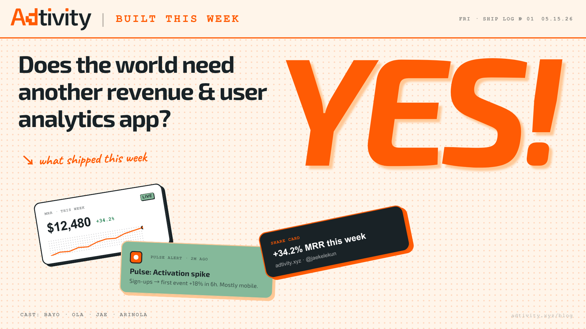
Neo-brutalism, terminal brutalism, then Cute-alism.
The thesis was straightforward. Iconic, sticky, comfortable, unmistakable across surfaces. The moment a founder sees an Adtivity card on X or Instagram or Substack, they should know it's Adtivity without reading the wordmark. That's what brand recognition costs you on day one, and we weren't going to short-change it. So we played with several options.
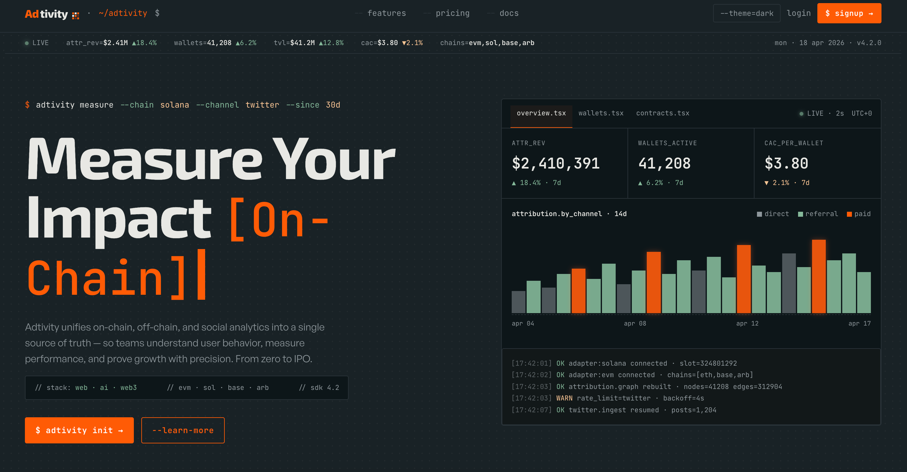
Palette landed on orange as the anchor, with green and yellow as secondary accents and gunmetal black as the ink. Orange is the distinct one. You don't get a lot of orange in B2B SaaS, and that asymmetry was the whole point.
For the art style, I'd been carrying a Neo-brutalism interest for months and brought it into Claude for exploration. We went through editorial brutalism and then terminal brutalism, both of which had moments but neither of which carried the warmth the brand wanted.
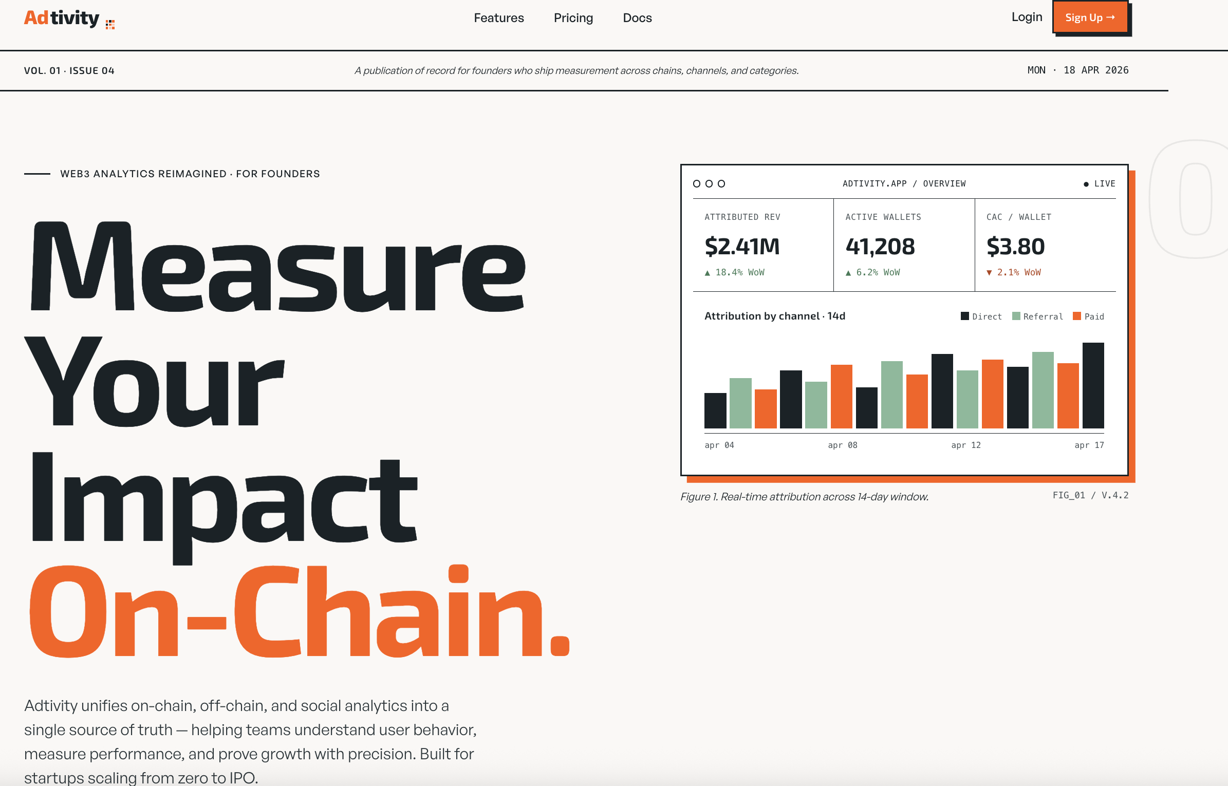
The interesting move kept landing somewhere between brutalism and softness, which is where Cute-alism came from. The name was half a joke that stuck because it well... stuck. The art style itself: 2px ink borders, offset solid shadows, generous radius on cards, peach background, mono accents for data, Exo 2 for display. Brutalism's structural honesty, with the edges softened just enough that a founder feels welcome instead of summoned.
Claude was the iteration partner for the exploration, and Claude Design did the entire mockup setup. The workflow was simple: get a prescribed art style and play with Claude until the direction crystallised, then hand it to Claude Design to produce the rendered surfaces I could put in front of people.
Ola says no to things that stress him.
Ola has a very specific habit. He says no to things that would stress him, and he says yes to things he can disagree with quietly later. The rebrand was a stress event by definition. He was going to say no on first sight.
So I didn't bring the homepage to him first. I designed the new landing page in Cute-alism, took screenshots, and showed it to most of the friend group before he saw it. Family, founder friends, people whose taste I actually trust on brand. Everyone was very impressed. The landing page felt like the version of Adtivity we kept describing to each other but had never put in front of a customer.
Ola caught me halfway through the rounds. He saw me showing it to someone, walked over, and looked at the screen.
He went, "No, no, no. I'm not going to do it. I'm not going to do it." But as the sweet cofounder he is, he spent the rest of the day porting his pages to Cute-alism on his local server.
The full-flow reveal.
Once I had the whole flow in Cute-alism end to end, I called the team meeting. Bayo, Ola, Arinola. I walked through the entire site from the landing page through onboarding, the dashboards, the Pulse Alerts preview, the share cards, settings, the whole flow.
Bayo was amazed. Arinola was amazed. Ola, who had spent the afternoon porting half the site to the new style on his own, decided to use the meeting to try to pull back in one specific element from the old page he'd been quietly refusing to let go of. Everyone shouted at him and he silently gave up. That was the moment the sprint properly started.
Most of the buttons didn't work.
The first 48 hours after the rebrand went live were ugly in the way Friday ship recaps are honest about being ugly. Most of the buttons didn't work. Half the iterations Ola had pushed on top of my Cute-alism direction had merged in ways that broke their event handlers, partly because he was trying to add his own design touches on top of the mocked surfaces and partly because we were moving too fast to merge cleanly.
Bayo sat in the team chat and roasted both of us through the entire bug bash. Not seriously. The kind of roasting a backend engineer is entitled to when the frontend is on fire and he is meanwhile in his own corner shipping the Paystack and Stripe integration without theatrical complaint. Every broken button got a fresh comment. Ola and I deserved it.
Ola's local server wasn't in much better shape than the deployed version. We worked through it, button by button, because we weren't going to ship a rebrand with broken buttons in front of 150 founders.
Morning to morning at home.
I designed the homepage at home, late night to morning, multiple nights in a row, because the demo was coming and I wanted the surface out as fast as possible. The design direction itself took about four days end to end. The rebrand itself, porting every page, was another week, maybe a little more if you count the bug-fix tail.
The rest of the features that shipped in the same window had been cooking for longer. That's the trick that made the recap so dense. The week of the demo was the week we pushed everything we'd been working on, all at once. The rebrand was the visible part. Underneath it, Bayo had been writing the Paystack and Stripe integration. The Google sign-in feature, which had been pending for a while, finally got merged. The signup flow, which had sat in the backlog for too long, got the overhaul it needed. Share cards landed. The Pulse Alert pipeline got its production version. Stuff that had been in flight for weeks suddenly all had a reason to ship the same week.
150 founders at SuperTeam Nigeria Startup Village 2.0.
The forcing function for the whole sprint was SuperTeam Nigeria Startup Village 2.0, an external founder gathering with around 150 builders in the room. We weren't the only product showing up that day, but we were one of the few showing up with a brand-new visual surface, a sharper positioning, and a working dashboard a founder could click through on the spot.
The Cute-alism design landed. Founders kept stopping at our table because the surface read different from everything else in the room, and the majority response was the same shape: this looks like a product that knows what it is. Which is the entire point of the rebrand. The old surface had not read that way.
"You give me high BP."
Two customer beats from the days after, both worth keeping on record.
A founder running a fintech on Adtivity spoke to me at the event, about the Pulse Alerts that landed in his inbox every Monday morning. His exact phrase was:
"You give me high BP."
He doesn't know whether the email is going to carry good news or bad news. He has to open it anyway. If it's bad news, he ships a fix that week based on what the alert called out. If it's good news, he doubles down on whatever drove it. Either way, the Pulse Alert began becoming the trigger for his Monday product decision.
A SaaS founder in the test phase told us something different but related. He plans his marketing campaigns around what the Pulse Alert calls out the previous Monday. If we drop a Pulse on Monday saying his engagement spiked in a particular cohort, he runs a campaign at that cohort that week. The product is sitting upstream of his marketing strategy now, and we didn't design it to do that on purpose. The feature found the use case on its own.
What's next.
V-Next from this rebrand sprint is short. Mobile cleanup is the immediate next surface, because most of our customers were coming in through desktops and laptops so now we are trying to get each arm working. The Cute-alism mobile pass hasn't had the same polish the desktop pass got. After that, the Founder Wall ships. The thesis on the Wall is in Wednesday's Notes from Building post, the one walking through why we left Web3 analytics in a bear market and rebuilt for AI-native founders. Execution starts this month.
Bayo's Paystack and Stripe integration is in test phase right now. Once it goes live, every Adtivity customer running revenue on either rail has the metrics surface they've been asking us for since the pivot.
What the sprint taught us.
The rebrand was supposed to be visual. It ended up being a forcing function for everything else we'd been cooking, because the week of the SuperTeam demo every backlogged ship suddenly had a deadline that meant something. The rebrand was the visible part. The Google sign-in, the signup overhaul, the Paystack and Stripe integration, the Pulse Alerts production push, the share cards: all of those landed in the same window because the rebrand gave them a reason to.
What I learned: ship deadlines aren't just for the ship at hand. They drag the rest of the backlog along with them, if the team is honest about what is half-ready to go. Most of what shipped in that window had been three-quarters of the way done for a long time. The demo just made it Monday morning.
Bayo earned his roasting privileges. Ola did the work, even when he was pretending not to. Arinola walked the founders through the new flow on the day. I sat at the table watching it land. We rebranded Adtivity in a week. Most of the buttons didn't work at first. They do now.
Jae led the rebrand and built the homepage at home, morning to morning. Ola said no for half a day, then ported every page. Bayo shipped Paystack and Stripe in parallel, and roasted both of them through every broken button. Arinola walked the new flow with founders at the demo.
Try Adtivity
See your product metrics in minutes.
No developer needed. Connect your app, get your dashboard, and understand your users from day one.
Sign up free →Land in your inbox.
We publish across the week and ship the highlights to Substack. Subscribe and the next piece lands the day it goes live.
Why We Killed Our Own Product in a Bear Market.
Marketing was the first thing cut. So we stopped building for marketers.
Read nextIdeologyWhat is brand ethos, and where does it live?
Walk into an Apple store with your eyes half-closed and you will still know which store you are in.
Read nextProductsA new way to get your metrics.
Pulse Alerts fire when your numbers move. Share Cards let you post what moved.